


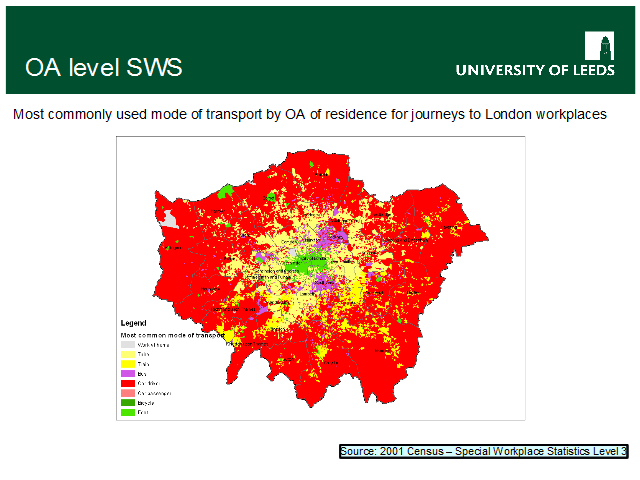
Another example, again of London commuters. On this map, each OA is shaded according to the mode of transport used by the majority of commuters living in that OA [biases occur – see note below]
Reds – cars
Yellow – train / tube
Green – bike / foot
Purple – bus
Grey – work at home
This largely fits an stereotypical assessment:
yellow in the areas well served by tubes,
bright yellow in south london areas poorly served by tube
green in central london (no point doing anything other than walking?),
The large ‘car fringe’ – unlike esp. tube journeys, these are not necessarily into Central London – this picks up shorter distance local commutes as well.
The oddest effect, perhaps, are the ‘bus havens’ – Hackney and Southwark. Affected by tube/train provision, and acceptable bus journey times to areas of major employment
A note about bias: this was quickly constructed as follows:
total all transport types for each OA.
find the maximum
flag the mode that has the maximum value
…but: there is a flaw – if more than one mode matches the max value (which is quite possible, especially given scam adjustments) then the ‘last’ mode (as listed in the map key) will always be identified as the one that is most commonly used. e.g. if train = 3, bus = 3 and taxi = 3, and all others = 0, then taxi will always be selected. One could randomly select from equal matches, but not easily in Excel…
NB about 3% of OAs have multiple matches to the maximum (c 0.2% are 3 or matches), so it’s not a huge problem