


Given, the concerns raised by SCAM, are the OA data worth using at all? The data do contain sensible looking trends, and on that basis are not entirely worthless.
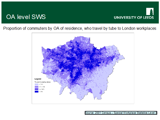
This map shows commuting flows for persons both living and working in Greater London. It is shaded to show the proportions of all commuters (regardless of their destination) living in each OA, who travel on the tube [for the largest part of their journey]. It is shaded using quartiles: the darkest shaded OAs are the 25% with the highest proportion of tube users. These OAs had > 30% of all commuters travelling by tube.
The map – in my opinion – clearly traces the physical path of the main tube lines.
See, for example: http://thefilter.blogs.com/thefilter/2006/05/the_real_tube_m.html