

Some of the ideas we have for future improvoments
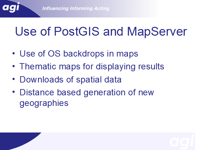
The maps displayed are flat shaded. Using mapserver’s capabilities we can add OS based raster backdrops in order to make selection of locations much easier.
The example shown of Cambridge used various different shades to convey information. It is obviously a pretty short step from here to creating thematic maps of results.
If results are to be presented as maps as well as tabular output, it makes sense to provide facilities to download spatial data with embedded interaction data. This can be done in a variety of formats.
There are many examples of analysis that can be conducted using spatial information. The example given showed the calculation of mean distances moved. Distance might also be used in others ways. A common type of analysis done by students is to select a core area of interest, and then various surrounding regions. We aim to develop tools that will automatically generate a new output geography, using distance bands around a core area of interest. Other analysis tools might make use of contiguity information embedded within the spatial data; for example this would assist in developing queries that looked at commuting between neighbouring districts.